Creative Assignment - Meta and Email Campaign
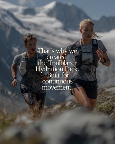
Product: Trailblazer Hydration Pack
1. CAMPAIGN OVERVIEW
Target Audience
Active, performance-driven individuals (20–40) who hike or trail run.
They already own some kind of gear but are looking to upgrade to something lighter, more comfortable, and more intentional.
They value: performance and efficiency, minimal, high-quality design and sustainability.
Value Proposition
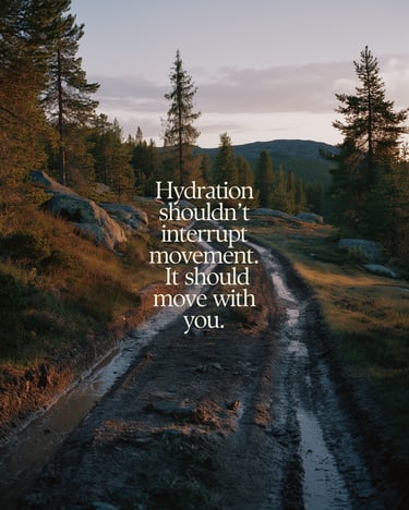
A hydration pack that removes friction from movement.
Trailblazer allows users to stay in motion with a lightweight, ergonomic, and hands-free design, while aligning with their values through sustainable materials.
Brand Positioning
TerraVibe Outdoors sits at the intersection of:
Performance - Sustainability - Comfort
Tone: premium and clean
Campaign Goal
Primary: Drive awareness and product interest
Secondary: Drive clicks and early conversions
KPIs
High CTR on paid social, strong engagement (saves, shares), comments and dms and website traffic from qualified users
2. CREATIVE STRATEGY
The campaign is built around one core idea:
“Uninterrupted Movement”
Instead of focusing on features first, the campaign focuses on the benefit of not having to stop, and how this affects performance
Key messaging pillars:
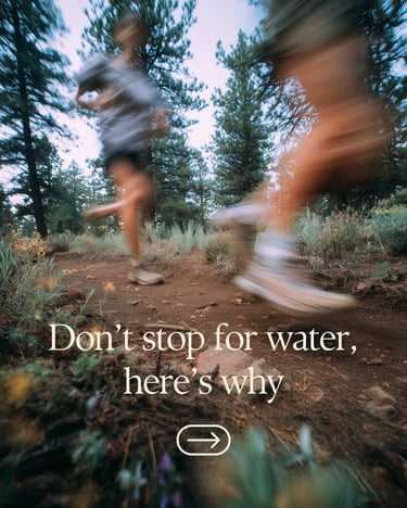
“Don’t stop for water” → scroll-stopping hook that does a pattern interrupt for users
“Worn, not carried” → product differentiation
“Nothing extra” → minimalism + performance
This creates consistency across: Paid ads, email, brand experience
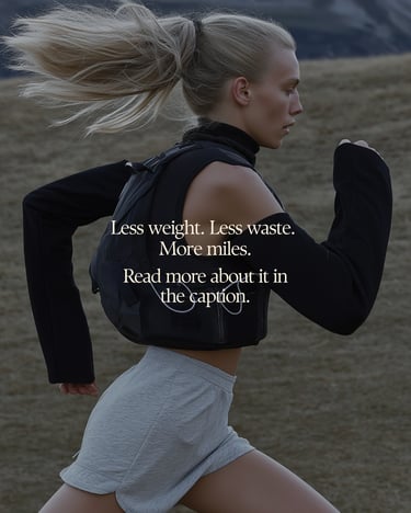
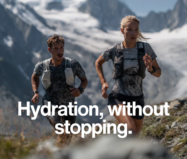
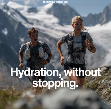
3. PAID SOCIAL AD (META)
Static carousel (5 slides)
Caption Copy
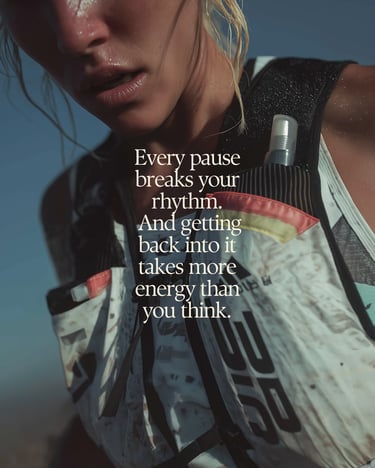
Stopping for water breaks your rhythm. It pulls you out of your pace, your focus, your flow. Most gear doesn’t help. It shifts, bounces, distracts, and turns small moments into interruptions. The Trailblazer Hydration Pack is built to eliminate that. Lightweight, ergonomic, and designed to move with you, so you stay locked in from start to finish.
Get 20% off your Trailblazer today. Use code TRAIL20 at checkout. Shop now.
Strategy & Design Rationale
The ad is a post designed as a high-impact carousel that builds curiosity first, then gradually introduces the product and its benefits in a clear, structured flow.
Idea Behind It
The core idea is to capture attention through a strong hook (“Don’t stop for water. Here’s why.”) and then guide the viewer through a logical narrative: problem → disruption → product → solution. Instead of leading with features, the ad focuses on the experience of uninterrupted movement and how poor or bulky gear can negatively impact performance during outdoor activity. This creates curiosity early, then uses progressive storytelling to increase engagement and encourage swiping through the carousel.
Design Choices
The visual direction follows a minimalist, premium outdoor aesthetic. The goal is to make the product feel high-end, functional, and aspirational without overwhelming the viewer.
Key design decisions include:
Minimalist composition to keep focus on message and movement, not clutter. Beautiful nature environments to reinforce the outdoor lifestyle context. Fit, active athletes to reflect the target audience and real usage scenarios. Subtle product integration so the hydration pack feels natural, not overly promotional. Clean typography to maintain readability and a premium feel. Consistent color palette across all slides to ensure cohesion and brand recognition
4. EMAIL DESIGN (COPY + STRUCTURE)
Strategy
The email is designed to convert interest into action by expanding on the initial hook introduced in the paid social ad. Rather than introducing new ideas, it reinforces the same core concept of uninterrupted movement, while giving the user just enough information to understand the product and make a decision.
The structure is intentional and linear: Introduce the product immediately, establish a clear point of differentiation, highlight key benefits in a simplified, digestible way, close with a strong offer to drive conversion.
The tone remains minimal and confident throughout, aligning with a premium outdoor brand while avoiding overly aggressive or sales-heavy language.
Design Rationale
Consistent core message
Every section ties back to performance and ease of movement, creating a cohesive narrative rather than disconnected features
Progressive information flow
The email moves from broad idea → product understanding → specific benefits → action, guiding the reader naturally toward conversion
Scannable structure
Short paragraphs and clear section breaks allow users to quickly absorb key information without friction
Premium positioning through restraint
The copy avoids clutter and excessive explanation, reinforcing a high-end, confident brand voice
Balanced conversion approach
The offer is introduced toward the end, ensuring the product value is established before asking the user to act
View full design: [TerraVibe Email Mockup – Canva]
Visual Production Note
All images used in this campaign were created using MidJourney.
This approach allowed for full creative control over the visual direction, ensuring consistency across all assets while maintaining a premium, outdoor-focused aesthetic. It also enabled rapid iteration of different environments, lighting conditions, and compositions to best align with the campaign message.