Recent ads
Concept: First-Person Search Intent & Volume Scale for NOCCO
Strategic Breakdown
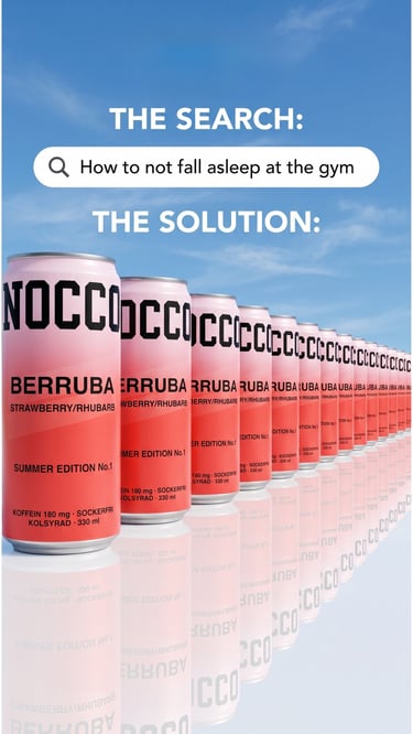
The Creative Angle: Problem-Solution Contrast Sequence. The ad opens with a highly specific, familiar search-engine query container calling out a granular, relatable pain point: "How to not fall asleep at the gym." It validates the user’s immediate physical state before deploying a grand scale visual solution.
Consumer Psychology: Cognitive Order & Massive Reassurance. The transition from a chaotic mental problem into a flawlessly aligned, infinite geometric horizon of the brand’s summer-edition cans offers a subconscious sense of sensory relief and immediate energetic availability.
Design Hierarchy: Deep linear perspective. The layout uses architectural alignment to force the consumer's eyes to scan the entire horizon of the product line, significantly increasing average watch time. The bright sky backdrop visually triggers crisp, clean outdoor associations to counter heavy, dark gym fatigue.
Concept: The Protein Pricing Psychology for Proteini Si
Strategic Breakdown
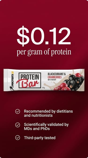
The Creative Angle: Quantitative Unit-Economics Hook. Fitness, weightlifting, and active wellness subcultures are intensely analytical buyers who calculate benefit-to-cost metrics constantly. Leading with a bold, undisguised financial equation—"$0.12 per gram of protein"—hooks the hyper-rational scroller instantly.
Consumer Psychology: Systematic Friction-Crushing. Low-cost high-macro assertions are naturally met with quality skepticism. The creative proactively neutralizes this buying block below the product image by stacking undeniable institutional authority checks (Dietitians, MDs, PhDs, Third-party tested).
Design Hierarchy: Bold, data-first contrast. The deep crimson background generates a high sensory appetite and urgency, while the massive white typography gives the core unit value mathematical supremacy over the page, demanding immediate text-read compliance.
Concept: Anti-Retention Trust for Bumble
Strategic Breakdown
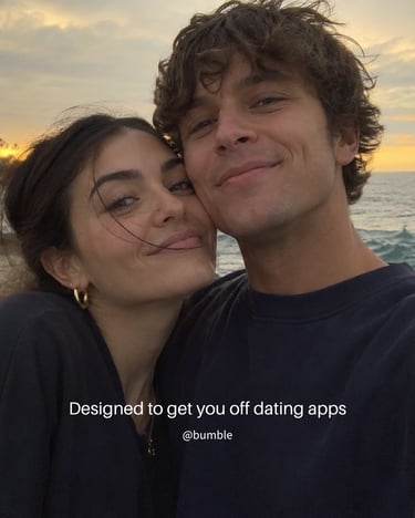
The Creative Angle: The Ultimate Value Proposition. This concept centers on a classic market paradox: pitching a digital platform by promising to help the user permanently delete it. It shifts the messaging entirely away from the gamified mechanism (the swipe) to the ultimate emotional ROI (the partner).
Consumer Psychology: Cynicism Deflation via Raw UGC. Modern app-users are highly cynical of polished lifestyle casting. To disarm this, the creative uses real, low-fidelity, unedited user-generated style imagery, a natural sunset beach selfie. The imperfection provides instant social proof that feels organic to a friend’s feed.
Design Hierarchy: Invisible Branding. The understated typography overlay directly mimics a native platform text tool (Instagram Stories/TikTok photo dump features), intentionally disguising the commercial nature of the asset to drive deeper hold-rates.
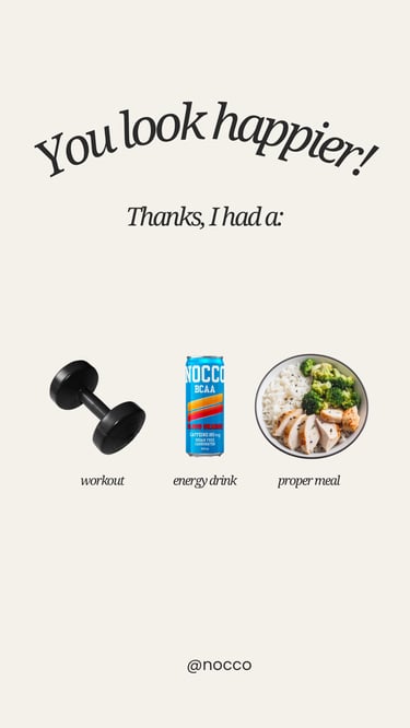
Concept: The Routine Alignment & Health Stack
The Creative Angle: Habit Stacking Asset. Instead of positioning Nocco purely as a synthetic stimulant, this ad uses a formulaic lifestyle sequence to embed the product into a customer's pre-existing, positive daily rituals.
Consumer Psychology: The Identity Halo Effect. By placing the Nocco can directly between a workout dumbbell and a clean, high-protein meal, the brand visually inherits an automated "health clearance." Consumers associate the product with a disciplined, aspirational lifestyle, minimizing guilt or health friction often associated with energy drinks.
Design Hierarchy: Clean organic-lifestyle editorial. The curved serif typography mimics top-performing creator-led aesthetics on TikTok and Instagram, positioning the ad as a trusted peer recommendation rather than a disruptive corporate pitch.
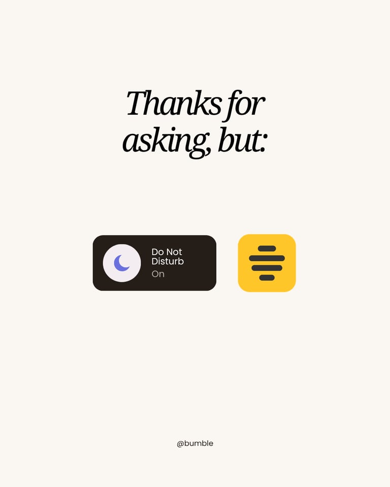
Concept: The Native Notification Pattern Interrupt
Strategic Breakdown
The Creative Angle: Native UI Mimicry. This concept exploits user muscle memory by using the familiar iOS "Do Not Disturb" system component to bypass traditional banner blindness.
Consumer Psychology: Notification Supremacy & Attention Filtering. The copy "Thanks for asking, but:" directly addresses the unanswered group chats, social pings, and work emails demanding the user's focus. By placing the active "Do Not Disturb" toggle side-by-side with the Bumble icon, the creative visualizes a strict hierarchy of attention. It communicates that while general mobile traffic has been entirely muted, Bumble is effectively "whitelisted" as the sole priority on the device. This positions the app as the single high-value signal worth interrupting for, cutting through everyday digital clutter.
Design Hierarchy: High-contrast minimalism. By dropping all branded clutter and isolating the UI elements against an expansive, premium cream canvas, the cognitive load is reduced to near-zero, ensuring a massive lift in hook rate.